Using Data to Visualize Connections Between Composers
coding
Social Network Analysis with New York Philharmonic’s Open Data
Being able to program is fun because it allows me to make cool stuff regardless of whether it’s useful to the real world or should even exist at all. In that vein, I decided to merge my love of programming, data, and classical music to make an app that visualizes the empirical connections between classical composers. If this sounds interesting or fun to you, read on and check out the code and app for this project!
The New York Philharmonic, being the national treasure that they are, keeps a Github repository of their program history. It contains lots of information on all the programs they’ve performed, including locations and times, composer information, soloist information, and even data on the intermissions. This is all encoded in either XML or JSON format, which any programming language can parse and analyze.
Defining Coperformance
This data allows us to explore the connections between composers based on a simple idea – how often do they appear in the same program together? We use this metric because music directors often put programs together based on a theme, like Romantic heroism, a program I saw the Chicago Symphony Orchestra perform in Ann Arbor consisting of Beethoven’s 5th and Mahler’s 1st symphonies (side note: it was really, really, really good). Two composers may be connected for a variety of reasons. They could compose similar music, use the same forms and techniques in different ways, or maybe have an interesting biographical connection. Whatever the link is, we would expect it to result in the two composers being programmed together more often than they would be otherwise. We can explore these connection in the New York Philharmonic because of the data’s specificity and incredible timespan, stretching back to the first season in Philharmonic history.
To do this, we’ll define a metric called “coperformance”. The coperformance between two composers is defined as the ratio between the number of times they appear in the same program and the number of times we would expect them to appear together at random. If it’s greater than 1, then we assume that means the composers are linked in some non-trivial way. If it’s less than or equal to 1, then we say the two composers aren’t linked.
The easiest way to understand this is through an example. Suppose we are examining two composers who appear on 1 out of every 100 programs. Let’s say, for the purposes of making the math easy, there are a million programs in the database. If the composers appeared together only at random, we would expect 1% of all programs to have the first composer and 1% of those programs to have the second, which means 0.01% of all programs (100 in this example) should have both. If in fact they appear together in 200 programs, their coperformance is 2, which means that data shows they are pretty strongly linked. If they only appeared together in just 90 programs, then we would say there’s no evidence in the data suggesting they are linked, beyond both of them being classical music composers.
It’s important to keep in mind that coperformance only measures the quantitative link between composers and is agnostic as to what drives the link. As we covered before, there could be a variety of things that link composers and cause a high coperformance, from musical style to biographical information to “maybe the music director likes both composers’ aesthetics together”. To figure out what drives the link specifically, someone would inspect the programs they appear in together and see if there’s a common theme.
Visualizing Coperformance
In order to visualize coperformance, we can make a social network. Before we get into how, let’s cover some terminology. Consider Facebook, the canonical social network example. Social networks are comprised mainly of two components: nodes and edges. A node is an individual in the network, like you or I or another individual Facebook users. An edge is a line connecting two nodes, like two Facebook friends. In our example, the edge is binary and non-directional (two people either are or aren’t friends, and I can’t be your friend without you being my friend), but in practice edges can have varying weights and can also be directional. In order to define the social network, one just defines the nodes and the edges.
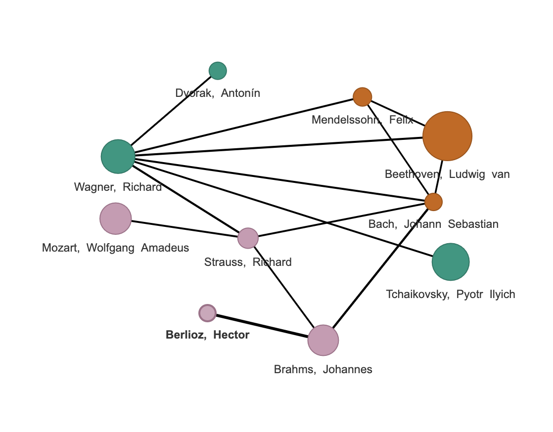
In our coperformance network, each node is an individual composer and the edges are weighted and connect composers who are linked via coperformance. If a pair of composers has a coperformance greater than 1, then they’ll have an edge between them. If their coperformance is less than or equal to 1, they won’t. We can further visualize the network by making higher weighted edges (stronger links via coperformance) larger and darker. We can do something similar with the nodes, making the composers’ nodes larger and smaller based on the number of times they’re performed in the program history.
As a final visualization tool to make the network even prettier, we can group the composers into clusters, or communities. If a group of several composers are intertwined, they’ll all have a high coperformance with each other. This is somewhat analogous to a social clique on Facebook. Visualizing the clusters is as simple as coloring the nodes according to the community they belong to. Before we go on, I think it’s worth mentioning two things. First, the details of how clustering works are beyond the scope of this post, but the Wikipedia page on social network analysis is a great place to start for those who want to go down the rabbit hole. Second, just like coperformance is agnostic as to what links composers, the clustering algorithm is agnostic as to what brings a cluster together. This is the domain of music directors and musicologists, not mathematics.
Overall, nodes of the coperformance network represent individual composer and have two attributes: a size to represent how often they’re performed and color to represent the community they belong to within the coperformance network. Edges in the network represent the coperformance link between composers and get larger and darker as the connection gets stronger.
Writing the Code
The process of building the coperformance network can be broken down into three major steps: reading data from a formatted file, iterating over all pairs of composers in the data to calculate their coperformance, and visualizing the resulting network. Go is great at the first two steps, but it doesn’t have any packages for network visualization which can match the ease of use and functionality of R’s igraph and visNetwork packages. Moreover, Rstudio’s shiny package makes building a user interface and downloading the data easier than any Go packages I’ve come across. This makes the project a natural use case for my sexp package. All of these ingredients were combined to make the app for visualizing coperformance on my shiny server.
To use the app, the user first specifies the data range (beginning and ending season) and minimum number of performance a composer needs to have to be included in the network. These are passed with the name of the data file from R (and the shiny package) to Go using sexp. Go then reads the file, parses the data according to the user’s specifications, calculates the coperformance for all pairs of composers in the network, and writes the results to JSON and csv data files the user can download. It does all this about 100 times faster than I could manage in R. R then gets the data file names from Go (passed via sexp), computes the clusters in the network, and visualizes it. To see more specifics, check out my Github repository for the project.
While this project wouldn’t be nearly as clean without the sexp package as it already is, it does highlight a weakness in the sexp package. In my post introducing sexp to the world, I complained that connecting R and Go via files is too cumbersome. And yet, I still have to do this with the network csv file because sexp doesn’t support the passing of matrices or vectors of strings (which would be needed to specify the composer names in the network) between R and Go. Bridging this gap would make the sexp package far more flexible and is at the top of my list to implement.
There is also a marginal improvement to be made using statistics. The number of appearances we have two composers to have together at random isn’t, statistically speaking, a specific number (like 100 in the example above) but rather a range of numbers based on probability. The coperformance metric is probably more accurate if we compare the number of actual appearance together to the upper bound of the range at a level of significance that is deemed appropriate (probably 95%). In the example, I think this would be 101 rather than 100. This improvement is probably marginal, but as someone who thinks he has a good grasp of statistics and data analysis, implementing this change should be pretty low-hanging fruit for me.
Overall, this coperformance project was just a hobby project allowing me to combine my enjoyment of programming, data, and classical music thanks to the awesome New York Philharmonic repository. You can check out the code on Github and the app itself over on my shiny server. Enjoy!